"Nationwide" mailing
BellSouth had been known solely as a regional phone company, a remnant of the split-up Ma Bell. The goal of this B2B direct mail piece was to announce data solutions for businesses nationwide. I am very pleased with translation of concept into visual, having designed the "circuit board map" for the inner reveal. Even though the package was a simple lidded box format, we were able use some nice printing techniques like an embossed foil stamping for the inner circuit map and a nice play of dull/glossy varnishes for the circuitry on the cover.
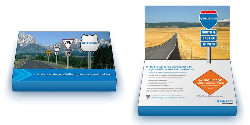
The "other idea"
For any given project, there's always a bunch of other ideas that never get to see the light of day. Sometimes the winning concept is so strong there was never any doubt it would win, but other times it is a real neck-and-neck race between ideas. This is the "other idea" for the Nationwide mailing. Arguably, I think this concept has better thinking and visual solutions. Using a road sign theme, we were able to represent the data services offered on the cover with the bang-on payoff of BellSouth (in an interstate sign). As an esoteric touch, there is a play in the types of signs shown: the cover depicts state and local sign styles, while the interior payoff is interstate, and therefore nationwide. To make for a higher impact presentation, the revealed interstate sign would have been pop-up.
It was a difficult decision for the client to pick the winning concept. I am proud that I had two great ideas and executions to offer.