UX User Persona and Storyboard

Personas and storyboards are simple but essential things to help define and establish a user experience. They help set the tone of who we are designing to and what those users need. Let’s start off with a persona:

MOTORPOOL_persona.001.jpeg

Now that we know who our audience is, let take a look at a storyboard view of what she needs and why. For me, storyboards generally quick sketches used to help communicate a user’s needs and frustrations, which helps target our design’s functionality & purpose.

StoryBoard.jpg

Frame 1 - “Sylvia occasionally needs to use her personal car to take business trips.“

Frame 2 - “She finds it annoying to keep track of her mileage and receipts.“

Frame 3 - “She would like a way to easily keep track of it all, right in the palm of her hand.“

Brochure for The Paralyzed Veterans of America

Cover

I was asked to design a brochure for the Paralyzed Veterans of America (PVA) that would be a showcase of good work the PVA has done. The tone of the piece speaks with thanks to donators past and present and looks forward to donators yet to come.

My Mission

Armed with brand guidelines, a rough outline, and a staggering amount of imagery I set out to tell a story about an organization with which I had only just become acquainted. The goal was to be bold, using easy to read facts to quickly paint a big picture. And what better way to back up facts than with strong, powerful imagery? Highlighting the main goals and pillars of the PVA, this piece gives the reader a quick and comprehensive overview of PVA's legislative and legal advocacy, employment assistance, and many levels of other support for America's disabled veterans and their caregivers. 

Start to finish, this 20 page brochure was created in a week's time. It was received by the leadership with overwhelming enthusiasm.


A few sample spreads

How NASA Helps Farmers

Fields being irrigated in Kanasa, as seen from space.

Fields being irrigated in Kanasa, as seen from space.

This brochure is both one of my most challenging and memorable projects for my time at NASA Headquarters. It proves the point to me (and every design teacher I've ever had) that visual communication is all about organization and hierarchy. It took a lot of back and forth work with the client to understand what they thought was important and to balance it all in a clean concise final product.

The final format was an 11x17" sheet tri-folded. In the end, it was very well received by its ultimate audience, members of the House and Senate of the United States Congress.

Covers and first reveal. Click image to view larger.

Inside spread. Click image to view larger.

NASA - Domestic Violence Posters

While concepting this project I realized that there are many permutations of what can be considered domestic violence. It bothered me that the stock art I was perusing was very heavily husband on wife oriented. I sought a way to be ambiguous and to tell a larger story.

The image below is arresting and visceral, but it is also open-ended.

Click image to view the full poster.


The image below was an alternate concept from the same project. I liked that it symbolizes the repercussions of domestic violence rather than the physical acts.

Click image to view the full poster.

NASA - Trip Book Covers

Travel is a part of many businesses, and NASA isn't an exception. Trip Books are basically itineraries of where to go, who to meet and when to be there. While mostly a templated and easy to produce product, these trip books covers provide a nice touch of design and customized, trip-relevant imagery.

A mission-specific trip for the Deputy Administrator to Chile, to review status and results of NASA's Operation IceBridge.

A mission-specific trip for the Deputy Administrator to Chile, to review status and results of NASA's Operation IceBridge.

A more generic cover. The purpose of travel wasn't disclosed, so imagery of the target location was selected, as seen from the International Space Station at night. Hard to beat photo resources like this!

A more generic cover. The purpose of travel wasn't disclosed, so imagery of the target location was selected, as seen from the International Space Station at night. Hard to beat photo resources like this!

Website Design and Template Coding for the IMF

Annual Meeting Registration Website


Problem

The original site was a collection inconsistent pages, born from multiple programmers with little UX or design background. No two pages were alike and all were very awkward to use. I was tasked with creating a beautiful, consistent & user friendly page design.

Solution

Using what I know about HTML and CSS, I designed and coded a few key html pages with CSS rules. This handful of pages showed how to present and code a wide variety of pages and items like tables and forms. The template pages were handed off to developers for the complete site blow out. Live pages are not available to the public, but the following links are a few of the templates I delivered to the programmers:

A favorite detail of mine from this project is a CSS-based drop down menu. Very little programming was needed under the hood.

The drop down CSS menu in action.

The drop down CSS menu in action.

Interactive Infographic for the International Monetary Fund

Flash-based with an external data file
 

Click image to view the working file

Click image to view the working file

The IMF’s Managing Director, Christine Lagarde, wanted an interactive graphic to show the progress of key HR initiatives for broadcast to the IMF’s rank and file via their intranet. As each initiative progresses, as defined by their sub-initiatives, the tree fills out with its color-coded leaves.

Being animated and interactive was a key request, however there are major drawbacks to using Flash in a case like this. Highest on the list is the ease and cost of constantly updating the file to always show up-to-date information. I have seen first hand the difficulties of updating a Flash file repeatedly. It can produce work load stress on a department as well as potentially corrupt or break a previously working iteration.

My solution to these pain-points for this graphic was to utilize an external data file. Such a file can be easily edited using any text or word processing program, no Flash experience needed. That means quick, easy, and instant changes done, to any of the key variables to update the graphic’s appearance, at the client's fingertips.

The working graphic shown here is a remote instance, not the IMF’s live graphic, which resides on their intranet.

CuervoNation Website for Jose Cuervo

Most product websites are about brand immersion. CuervoNation.com was brand as lifestyle immersion. Built back when all Flash sites were the rage, CN.com packed a seeming ton of content into a very slick interface. Fun, hip, and highly targeted to our college-aged demographic CN.com was a very good early way for a brand to create a community.

Demo the site

View a walk-through demo of CuervoNation on YouTube now. Click the image above.

Brand as experience

CuervoNation was about being young and hip and having fun. Flash was the king of the moment and we experimented with new and innovative ways to engage our site visitors. One of my favorite methods was the CuervoNation Generator. It allowed the user to play online with Cuervo branded assets: backgrounds, images of people from Cuervo's brand assets library, music, and texture enriching "extras" that deepened the brand experience.

Click to view a demo run-through on YouTube

The result

  1. Very long site visits and brand immersion
  2. Lead generation - use your email to send your generated experience to a friend
  3. Viral - friends that came to view a generated experience often made their own, too

Brand as community

It's a bit hokey, but Jose Cuervo really did rent an island in the Caribbean and called it CuervoNation, so we built a myth around it. We created a story that a group of friends decided to make a pact and declare their independence from the mundane. Where would they do this? In a bar, of course! It was my idea to create the original bar napkin version was included as an easter egg on the site.

Click to view the whole image

Commit Lozenges - "Cappuccino" new product launch for Glaxo Smith Klein

Commit.com homepage as it appeared when we launched Commit Cappuccino flavor.

What happened and why it's not that simple…

We were tasked to support Commit Lozenges new flavor launch of "Cappuccino" through interactive channels. Sounds easy, but studies have shown us that the urge to smoke is strongly linked to "trigger" activities. Coffee is a HUGE smoking trigger (and we weren't sure why Commit's brand team didn't see that), so we needed to think of ideas that could turn that to our advantage.

"The only thing better than coffee and a cigarette is…"

Click to see Commit.com's homepage content highlight come to life.

Reinforcing the stop-smoking message with an animated Flash module on Commit.com's homepage. we used "cappuccino art" to help defuse this trigger. This Flash module also helps connect the site visitor to content (and savings) found deeper in the site. 

Is that all you did?

Not by a long-shot. We did a subtle color palette change for the entirety of Commit.com to reinforce the branding of the new flavor launch. We also created a number of sub-pages, specific to the new product launch, which drove registration and lead generation by offering a a free trial of the new product. There were also "Cappuccino" branded email streams that followed new registrants/users on an established schedule of "check-ins" covering the weeks it takes to start a smoking cessation program.

Commit Lozenges rich media unit for Glaxo Smith Klein

Click to view the interstitial in its entirety.

What were the goals?

Concept and create a branded rich media experience that leverages existing assets from the television campaign.

This unit appeared on ABC.com's Full Episode Viewer as a paid advertisement before and during video content. It was originally presented as multiple parts: intro before content, commercial break 1, commercial break 2 and a pause screen. You can see the whole experience above.

Here are a few screen shots. Click to view larger:

"Nationwide" Long Distance Service Mailing for BellSouth

"Nationwide" mailing

BellSouth had been known solely as a regional phone company, a remnant of the split-up Ma Bell. The goal of this B2B direct mail piece was to announce data solutions for businesses nationwide. I am very pleased with translation of concept into visual, having designed the "circuit board map" for the inner reveal. Even though the package was a simple lidded box format, we were able use some nice printing techniques like an embossed foil stamping for the inner circuit map and a nice play of dull/glossy varnishes for the circuitry on the cover.

The "other idea"

For any given project, there's always a bunch of other ideas that never get to see the light of day. Sometimes the winning concept is so strong there was never any doubt it would win, but other times it is a real neck-and-neck race between ideas. This is the "other idea" for the Nationwide mailing. Arguably, I think this concept has better thinking and visual solutions. Using a road sign theme, we were able to represent the data services offered on the cover  with the bang-on payoff of BellSouth (in an interstate sign). As an esoteric touch, there is a play in the types of signs shown: the cover depicts state and local sign styles, while the interior payoff is interstate, and therefore nationwide. To make for a higher impact presentation, the revealed interstate sign would have been pop-up.

It was a difficult decision for the client to pick the winning concept. I am proud that I had two great ideas and executions to offer.

"411" Directory Services Mailing for BellSouth

What needed to be done:

Grab the attention of C-level businessmen to tell them that they do not have to go overseas for affordable 411 Service… it's in you backyard. How'd we say that? With BBQ.

This was a highly targeted, very limited mailing to C-level recipients. We cut through the clutter with size and novelty… and a kick-ass response premium of Omaha Steaks.

The Long Story:

Many services, like directory assistance, were being handled remotely in places like India, because of the perceived cost savings. BellSouth proudly still offered this service and wanted a way to support their sales force by generating leads. My copywriting partner and I were tasked with creating a highly targeted direct marketing piece to be sent to a very short list of C-level, decision making recipients. It had to be something that really stood out. Something that begged to opened and was compelling enough to convert into an in-person sales call. 

We quickly hit upon the kernel of an idea of "service in your backyard", but we needed a way to connect it to our mailing. The connecting tissue came with another backyard activity: grilling and barbecue. Because of the high profile nature of this mailing, we were fortunate to also have a substantial budget. We mailed a bottle of BBQ sauce in the initial lead generation mailing with the fulfillment promise of Omaha Steaks if an in-person sales call was scheduled.

1800Tequila.com

1800 Tequila had a problem. 1800 is owned by Jose Cuervo and couldn't seem to escape it's brother's shadow. We were tasked to build 1800's online presence to help differentiate itself. The research and strategy suggested something elegant and of high quality. We chose to elevate it even higher, to a level that connoisseurs would appreciate. We also wove a air of mystery… that this was a best kept secret, so tell no one.

The result was an elegantly simple site, understated and confident. Now, you know, too. Welcome to the club.

State and Local Government web banners for Microsoft

One of a series of 10+ banners. Built on a templated look/feel/animation

One of a series of 10+ banners. Built on a templated look/feel/animation

No, not the most spectacular banners ever made, but a they were challenging in their own way.

Some projects are more about the process

What happens when Agency and Client have radically different ideas about how a project should be done? As an agency, we wanted to be as creative as we could, which meant every single banner would undergo full creative development. With the scope of more than 10 banners to do, that takes a lot of time, money, and resources to accomplish. The client's view was along the lines of "These are just web banners. What is taking so long? And why so expensive? Should we take this project elsewhere?"

Manage/set the expectations. Make a plan.
Template, template, template!

Thinking back to my time at MRM, cranking out Flash banners like there was no tomorrow, I could see the necessary solution. It would take a cards-on-the-table approach, but if we can get all the of the key players, Creative/Account/Client, to agree on a scope of what was expected and also agree to a "template solution" we could keep this project in-house, crank them out, and keep the client happy.

Also thanks to my time at MRM, these banners were animated via heavy coding. The initial setup took some time, but the end result was incredibly fast turnarounds for each new banner. Change image & text, adjust a few code numbers to change the timing and a new banner is born. There was little-to-no mucking around moving keyframes on a long time line.

Economy is an impressive teacher, and what I learned most from this project is across the board communication. Difficult tasks are achievable if expectations are managed accordingly.

"DevEd" videos for Blackboard, Inc.

Click to view screenshots from the storyboards.

Uploaded by jurigadesign on 2011-10-25.

Uploaded by jurigadesign on 2011-10-25.

I inadvertently helped brand and launch a new product for Blackboard, Inc. called Developmental Education or "DevEd". Initially, I was asked to design a quick "one-sheet" sales tool. In the course of designing visuals to help describe the new product quickly I developed something that we called "the orbit graphic", which showed the key elements and stages of the product and how they encompass the student. I was unaware that the hurried work I had done for such a "little" project would actually effect the overall branding of the product. 

The one sheet, and especially the orbit graphic, were very well received and I was contracted again to create a short presentation video (in the :45 to 1:00 range) to be given at conferences and sales meetings. I was provided with an initial script by the client which was overly long and worded in their own "internal speak." I reworked/rewrote the script in order to condense it and to make the language approachable to everyone, not just people who work at Blackboard.

In the process of script editing, storyboarding, and sharing with other stake holders, more and more content was added to the point where our "short little video" soon ran at over 7:00 minutes long when read out loud. I could not condense it down any more and still hit all the topics that were requested. So I discussed with my client a solution to create two videos: the first to set up the problem and why DevEd is needed and the second to dive into specific functionality and how DevEd works.

Once the scripts and storyboards were approved, we hired professional voice talent to record the VO, chose a music track, and I sat down work some After Effects magic. On a geeky note, this project was fun because it finally allowed me to play with AE's limited 3D spatial abilities. Please view the videos below:

XELJANZ "MOA Video" for Pfizer

Click to view the video on YouTube

Click to view the video on YouTube

Problem #1 - Make a very scientific topic understandable to everyone.

Method of action, or "MOA", is the term for the science behind how/why a drug works. Typically these explanations in their purest forms are scientific gobbledygook to the average person. So, the problem my copy-partner and I solved on this project was how to make an extremely "science-y" topic easily and quickly understandable for the general public. We created an analogy that everyone can related to, rain.

Problem #2 - Overcome your clients' preconceptions.

From the start we could tell what the client "thought" they wanted. We were even directed to reuse an :06 second video asset created for the TV campaign. Easy-peasy… or so they thought. No one really expected much out of this project. If we delivered that way the results would either be incredibly lack-luster, not do its job very well (see Problem #1), or BOTH. We fought to over-deliver.

Problem #3 - Make something out of nothing, with very little money.

We had a great idea that we needed to bring to life. Thanks to the Project Management and Account teams, we found the money to do more than what was initially budgeted. Live action or full motion animation was not going to happen for both budget and timing reasons, but a limited motion animatic could be done. We developed a look and feel that could be brought to life.

I am pleased with the final piece as it solves some pretty difficult problems, communicates the ideas that it should, and delivered more than it was expected.

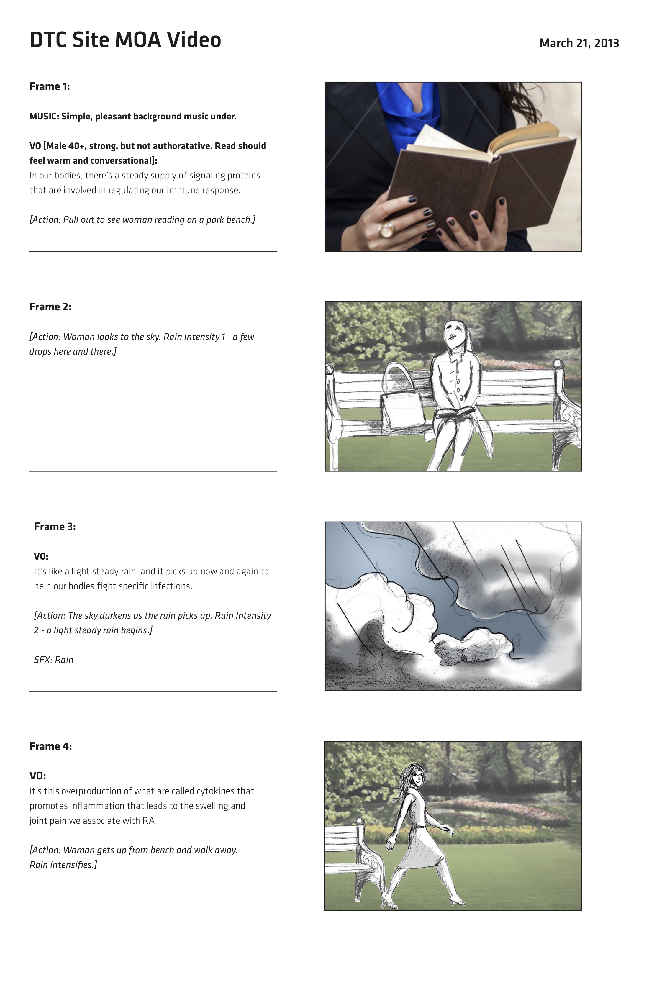
Update: Storyboard samples

As with most video productions, a precise storyboard needs to be created to direct the action scene-by-scene. Using a mixture of stock art and quick drawings, here is what I produced for this project.

CuervoNation.com "Endless Summer" Campaign for Jose Cuervo

The CuervoNation.com "Endless Summer" campaign was one of those projects that didn't entirely make sense at first, but my copywriting partner and I were able to find the idea to make it all come together. Looking back, it ranks among my most favorite ideas.

A PR firm had a publicity stunt all set to go for Jose Cuervo, which we supposed to tie into and develop a lead generating contest for their consumer-focused website CuervoNation.com. The PR stunt was to happen on the steps of the capital in Washington, DC as a rally to get Congress to move the date of Labor Day, the unofficial end of summer, to a later date. While that is fine for a PR stunt, political activism wasn't really the tone or voice for CuervoNation.com. We needed a way to bring grassroots to the beach… and ultimately that was our idea. What better place to communicate to like-minded people. So it's fun political activism, complete with campaign buttons as a branding element.

Take a screenshot walk-through of the "Endless Summer" contest microsite. Click on the images above.


One of Jose Cuervo's recurring missions for us, and a corner stone of direct marketing, was lead generation: people signing up as interested in the product. Endless Summer did that on steroids as it was geared around a viral marketing engine we devised. Sign the petition, then enlist other people to sign. The person with the most signatures wins an end-of-summer party thrown by Jose Cuervo. A microsite section of CuervoNation.com was created to host the contest details, along with real-time, database driven results as added incentive for users to try and win the contest.

Concept, design, and CSS programming too?

My developing team was very slammed with creating the database links and queries needed to drive the microsite properly. In order to keep the project on schedule, I lent a hand by developing a lot of the front end pages. With a  quick introduction to CSS from the Dev Team, I proceeded to crank out real-life CSS structured pages for the first time. I love projects that I can learn and grow from.

Animated email? It's actually quite simple!

Click to view the full email

"Passport" was a monthly e-newsletter developed to speak to our CuervoNation.com contact list as grown through our various lead generation tactics. Here is how "Endless Summer" looked in for the Passport email edition.

Animated email? It's actually quite simple!

The animated portion of the Endless Summer email.

The animated portion of the Endless Summer email.

Something I think is under-utilized for email is animated GIFs to build the message, as most email programs can handle them. It's really a small thing, but it's a nice touch that isn't utilized very often in email.

XELJANZ Rich Media Banner for Pfizer

A very simple, yet impactful rich media banner using video. Reinforces the idea that XELJANZ is a powerful medicine for severe rheumatoid arthritis in the simple form of a pill - a first in its class.

Click to see the storyboard...

After many rounds of storyboarding for final client and legal approval, we selected a hand model and booked a video studio to shoot live action. Knowing what I could accomplish myself in post-production, I worked with the videographer to simplify the shoot as much as we could. By leaving the complexities of things like zooming and timing to tweak in After Effects post-prodcution, the shoot was a simpler and much quicker affair.

Jose Cuervo Overview Reel

Click to view presentation reel

What you're seeing

DraftDigital was asked by Jose Cuervo to summarize our past year of creative work with some sort of rousing compilation reel. The reel was shown at their annual sales meeting. Being the lead Art Director on the account, the project fell to me to work on.

What you're REALLY seeing

Looking back, this is a very fitting project for me because it summarizes a lot of the work I had done for Jose Cuervo. This reel isn't just a Flash piece, it highlights everything I had done for Cuervo to that date: websites (both traditional and Flash), micro-sites, email, banners, new product launches and more.

Source: https://youtu.be/bxyIBZ8w634

Various Letters and Emails for Pfizer's XELJANZ

Click to view larger.

We did a number of different direct mail and email to cover the different marketing tactics (acquisition, conversion, etc.) for Pfizer's XELJANZ product. Whether the goal was for lead generation for the direct mail channel, incentive to convert to product use, or other goals, the communication and especially the call to action must always be clear and at the forefront. 

Best practices

The driving purpose behind these letters and emails was to initiate a response. The calls to action are consistently prominent, towards the top of the layout. Always remember, you have seconds to make an impression (if you're lucky), so don't bury the ultimate goal.

A few samples from the group