Website

CuervoNation Website for Jose Cuervo

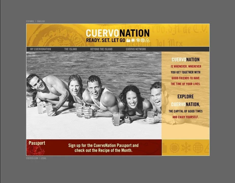
Most product websites are about brand immersion. CuervoNation.com was brand as lifestyle immersion. Built back when all Flash sites were the rage, CN.com packed a seeming ton of content into a very slick interface. Fun, hip, and highly targeted to our college-aged demographic CN.com was a very good early way for a brand to create a community.

Demo the site

View a walk-through demo of CuervoNation on YouTube now. Click the image above.

Brand as experience

CuervoNation was about being young and hip and having fun. Flash was the king of the moment and we experimented with new and innovative ways to engage our site visitors. One of my favorite methods was the CuervoNation Generator. It allowed the user to play online with Cuervo branded assets: backgrounds, images of people from Cuervo's brand assets library, music, and texture enriching "extras" that deepened the brand experience.

Click to view a demo run-through on YouTube

The result

  1. Very long site visits and brand immersion
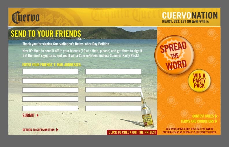
  2. Lead generation - use your email to send your generated experience to a friend
  3. Viral - friends that came to view a generated experience often made their own, too
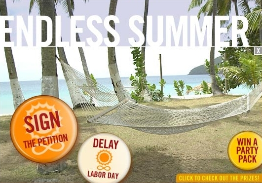
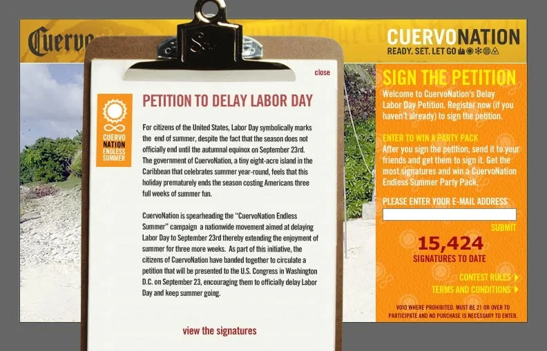
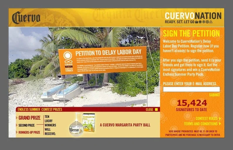
Brand as community

It's a bit hokey, but Jose Cuervo really did rent an island in the Caribbean and called it CuervoNation, so we built a myth around it. We created a story that a group of friends decided to make a pact and declare their independence from the mundane. Where would they do this? In a bar, of course! It was my idea to create the original bar napkin version was included as an easter egg on the site.

Click to view the whole image

Commit Lozenges - "Cappuccino" new product launch for Glaxo Smith Klein

Commit.com homepage as it appeared when we launched Commit Cappuccino flavor.

What happened and why it's not that simple…

We were tasked to support Commit Lozenges new flavor launch of "Cappuccino" through interactive channels. Sounds easy, but studies have shown us that the urge to smoke is strongly linked to "trigger" activities. Coffee is a HUGE smoking trigger (and we weren't sure why Commit's brand team didn't see that), so we needed to think of ideas that could turn that to our advantage.

"The only thing better than coffee and a cigarette is…"

Click to see Commit.com's homepage content highlight come to life.

Reinforcing the stop-smoking message with an animated Flash module on Commit.com's homepage. we used "cappuccino art" to help defuse this trigger. This Flash module also helps connect the site visitor to content (and savings) found deeper in the site. 

Is that all you did?

Not by a long-shot. We did a subtle color palette change for the entirety of Commit.com to reinforce the branding of the new flavor launch. We also created a number of sub-pages, specific to the new product launch, which drove registration and lead generation by offering a a free trial of the new product. There were also "Cappuccino" branded email streams that followed new registrants/users on an established schedule of "check-ins" covering the weeks it takes to start a smoking cessation program.

1800Tequila.com

1800 Tequila had a problem. 1800 is owned by Jose Cuervo and couldn't seem to escape it's brother's shadow. We were tasked to build 1800's online presence to help differentiate itself. The research and strategy suggested something elegant and of high quality. We chose to elevate it even higher, to a level that connoisseurs would appreciate. We also wove a air of mystery… that this was a best kept secret, so tell no one.

The result was an elegantly simple site, understated and confident. Now, you know, too. Welcome to the club.

CuervoNation.com "Endless Summer" Campaign for Jose Cuervo

The CuervoNation.com "Endless Summer" campaign was one of those projects that didn't entirely make sense at first, but my copywriting partner and I were able to find the idea to make it all come together. Looking back, it ranks among my most favorite ideas.

A PR firm had a publicity stunt all set to go for Jose Cuervo, which we supposed to tie into and develop a lead generating contest for their consumer-focused website CuervoNation.com. The PR stunt was to happen on the steps of the capital in Washington, DC as a rally to get Congress to move the date of Labor Day, the unofficial end of summer, to a later date. While that is fine for a PR stunt, political activism wasn't really the tone or voice for CuervoNation.com. We needed a way to bring grassroots to the beach… and ultimately that was our idea. What better place to communicate to like-minded people. So it's fun political activism, complete with campaign buttons as a branding element.

Take a screenshot walk-through of the "Endless Summer" contest microsite. Click on the images above.


One of Jose Cuervo's recurring missions for us, and a corner stone of direct marketing, was lead generation: people signing up as interested in the product. Endless Summer did that on steroids as it was geared around a viral marketing engine we devised. Sign the petition, then enlist other people to sign. The person with the most signatures wins an end-of-summer party thrown by Jose Cuervo. A microsite section of CuervoNation.com was created to host the contest details, along with real-time, database driven results as added incentive for users to try and win the contest.

Concept, design, and CSS programming too?

My developing team was very slammed with creating the database links and queries needed to drive the microsite properly. In order to keep the project on schedule, I lent a hand by developing a lot of the front end pages. With a  quick introduction to CSS from the Dev Team, I proceeded to crank out real-life CSS structured pages for the first time. I love projects that I can learn and grow from.

Animated email? It's actually quite simple!

Click to view the full email

"Passport" was a monthly e-newsletter developed to speak to our CuervoNation.com contact list as grown through our various lead generation tactics. Here is how "Endless Summer" looked in for the Passport email edition.

Animated email? It's actually quite simple!

The animated portion of the Endless Summer email.

The animated portion of the Endless Summer email.

Something I think is under-utilized for email is animated GIFs to build the message, as most email programs can handle them. It's really a small thing, but it's a nice touch that isn't utilized very often in email.